TAFE NSW
TAFE NSW was one of my biggest projects I ever worked on since I joined Squiz. I had so much fun working with the team and the client, and also learned so much while getting through some challenges.
Invited to TAFE NSW project
TAFE NSW was a quite big project. The website itself had many different pages with a different design which required advanced front-end skills. Also the overall architecture was quite sophisticated between the front-end and the back-end.
Due to this, the team needed a more senior front-end developer to be able to understand the insight of the project and provide the quality front-end work. So I was invited to join the team.
Team size was relevantly big. There were around 10 people from
- Architect
- Project manager
- Front-end developers
- Matrix implementer
- Engineers
- Sys admin
- Designer
- UX
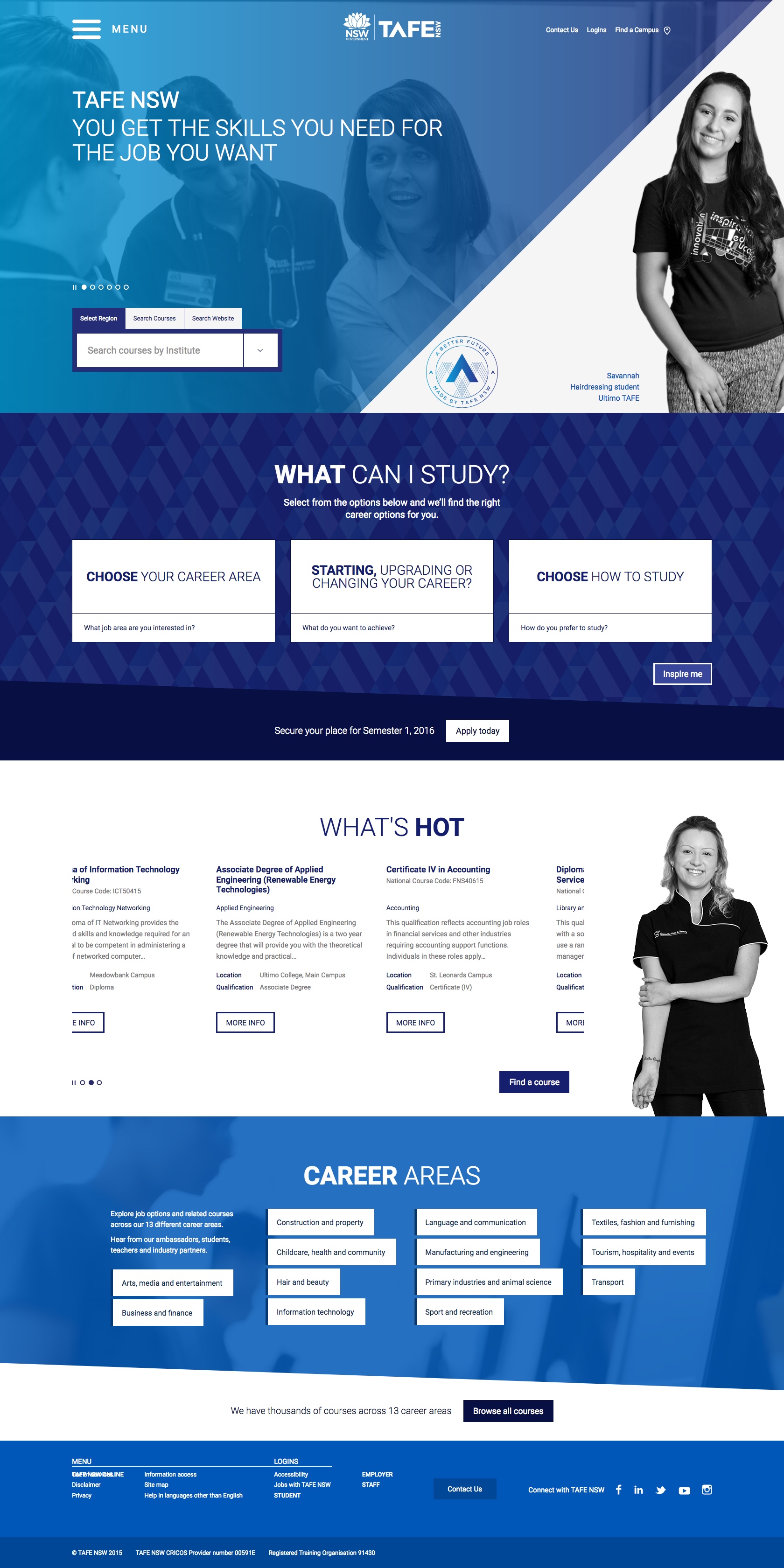
Amazing Design
Our senior designer did a great work. He designed each page very carefully so it’s looking great but also providing good usability to the users.
The designer tried many new design approaches too but that challenged me and the other front-end developer as we had to find a way to craft the complex design into code.
But overall, the client was quite happy with the design and also personally I really enjoyed building this beautiful website.

Challenges
Some of the challenges were:
- Making the slider dynamic and accessible
- Building the customized dropdown menus
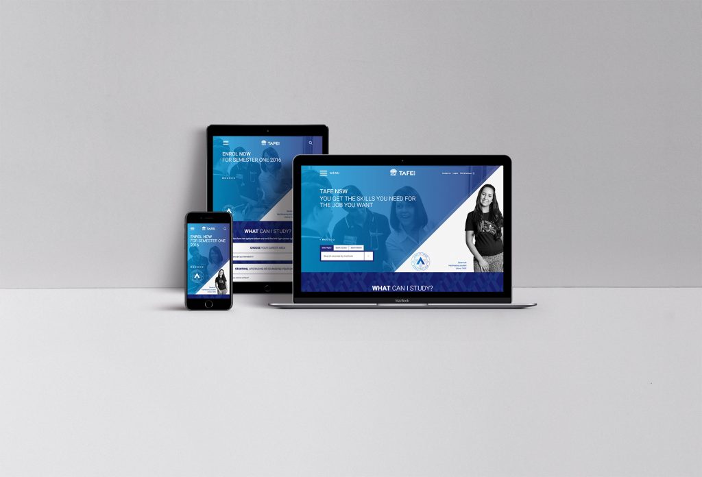
- Making complex components responsive
- Controlling the layout and z-index
- etc
Solutions provided
Me and the other front-end developer discussed a lot and when needed, we had meetings with the designer and other engineers to make sure our solutions will work.
The solutions we provided were:
- Making the slider dynamic and accessible
We used SlickSlider but also added some custom JS functions to make the slider more dynamic and accessible. We made sure with engineers this solution will work for them too. - Building the customized drop-down menus
This was quite challenging as we not only had to create a new style for the drop-down menus but also we had to make it keyboard-accessible. We listed all the possible scenarios and planned well before actually writing any code. - Making complex components responsive
The biggest challenge for this issue was the hero section in the homepage, especially with the triangle shape. We decided to use SVG to create the triangle effect. - Controlling the layout and z-index
Because there were quite a lot of small components attached to the larger components, we had to plan well ahead building the components.
All of the solutions including those not included in the list above worked out well and we could deliver the website on time with quality code.
A11y
Me and the other front-end developer spent quite a lot of effort into accessibility. Especially, I have personally met and worked with a staff member who actually had to use a screen reader to interact with the website because of his eye condition.
Working with him gave me so much valuable experience and helped me realize that just passing WCAG AA is way not enough to make the website accessible. There are much more than just checking WCAG level such as making web pages keyboard-accessible and providing necessary information when there were any changes happening on the screen.
Since then, the accessibility became one of my most important areas and I always make sure web pages and components I build is accessible.
Overall
Probably it was one of the most challenging projects but also one of the best projects I ever worked on.
I would like to give a big shout out to the team, but especially to Flore (front-end developer) 👍 who gave a great contribution to this project.
