
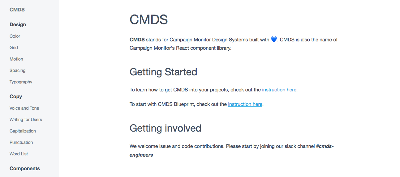
CMDS
CMDS (Campaign Monitor Design System) is one of the core products for UI services team at Campaign Monitor and it helps engineers build solid products with consistent code base.
CMDS journey begins
When I joined CM, we had an old CMDS which was (in my opinion) over-engineered and quite complex to maintain. UI services team (my team) decided to re-build CMDS. Our goal with new CMDS was to make it:
-
Scaleable so it can be used in any products without any additional updates
-
Extensible so engineers can add additional features if needed for their products
-
Maintainable so we don’t waste our time to understand the code
We have built the core structure from scratch but still reused and improved the existing pattern libraries where possible so we don’t just throw away all the effort and time invested before. It also helps us support the old system (e.g., Monolith) which still required to have the old CMDS.
React, JEST, SASS, Storybook & Lerna
New CMDS has been built on React (and JEST for the unit testing) and quite carefully crafted with better CSS structure with SCSS.
For the app testing environment, we have used Storybook which gives us a simple but straightforward way to test components quickly.
To package components, we have structured the project with Lerna to split up the components into separate independently versioned packages. It worked out really well as Lerna provided us better workflow around managing multi-package repositories with git and npm.
A11y
We took the accessibility very seriously and spent a lot of time to research to build all of the CMDS components accessible.
Many thanks to W3C for their great work on providing details and working examples for the accessibility here.
Our main focus on the accessibility was to provide:
- above WCAG AA for colors
- all components are keyboard accessible
- correct form elements
- proper ARIA attributes when necessary
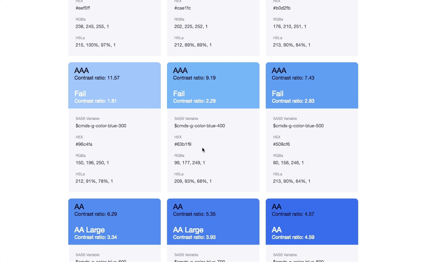
A11y - Colors
Providing contrast ratio for both white and black colors on CMDS colors. It also contains SASS variables and different color formats such as hex, RGBa and HSLa.
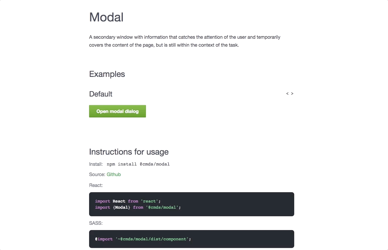
A11y - Modalbox
Providing key traps inside the modal box and also keyboard access (e.g., ESC key to close the modal box).
Components built
Our team has developed around 40 components and guides for CM engineers to build their CM products easily. It includes components such as banner, button, input, spinner, table etc but also guides on color, grid, list, motion, spacing and typography.
It’s been about 6 months since we started building new CMDS and so far the progress has been great.

Nice work on the CMDS docs for Grid. I found them very useful.
Communicating with Designers and Writers
The whole idea of design system is to align the same business goal with all different departments such as designers, engineers and writers.
At CM, we are doing really a good job on that. We talk constantly and improve CMDS documentation together. For example, our tech writers are putting efforts on:
- Voice and Tone
- Writing for Users
- Capitalization
- Punctuation
- Word List
Loving the changes to the CMDS color guides since I last looked at it – the contrast ratio/WCAG 2.0 details, and preview of all white/black and text/background combinations.
Going Public? Maybe…
Our aim is to publish CMDS components to public, so not only engineers at CM but also all other developers and engineers out there can enjoy CMDS and build solid apps.
It’s not gonna happen tomorrow but surely we want to publish it, but not sure yet when it would be. One day… 😉