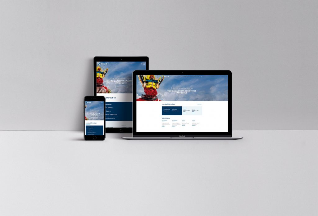
Oil Search
My main focus on this project was to provide better user experience, especially around the readability, and make the website accessible; also help front-end team build a solid product with quality code.
Joined the Project as Front-End Lead
My main responsibility was to provide the front-end technical advice to TC and also to lead the front-end team to write quality front-end code. Also, myself has built some complex components, especially around the web animation and accessibility.
Challenge
One of the biggest challenges was the tight deadline. We had to complete the entire project within a short timeframe. That meant there were not many days allocated to the front-end team to complete the front-end work.
To meet the tight deadline, I had a meeting with TC and PM very often and updated them how the front-end team was progressing.
For the front-end team, I was always trying not to give the team any pressure with the tight deadline. What I did (and usually do) was to catch up with the team every morning and make sure they had no blocker, and also saw if there was any help they needed.
We also tried hard to utilize Lorikeet (the pattern library we built at Squiz) so it could help us save a lot of time, and also at the same time help us produce a quality product.
Overall, we managed the schedule very well and provided the complete front-end code to the implementer without any delay.
As always, we had put a lot of effort into accessibility, by not only passing WCAG AA but also providing proper HTML markup and ARIA attributes; also made the website keyboard-accessible.
One of the examples is to make the search field keyboard-accessible as shown in the video below.
Web Content Flow Animation
We also tried to provide a better experience with the web content flow by applying some animation.
Hero Section
Instead of showing the partially broken hero image while loading, we have developed it so the image will be smoothly shown when completely finished loading followed by the content fading in smoothly in order.
Content Box
We applied the animation to the content box so it catches the eye movement and gives a correct direction with which side users should start to read as there are two different content box styles: one with an image on the left side and the other on the right side.
But NOT Too Much
Our main focus on the content flow animation was to provide users better reading experience so we only provided the animation when it was necessary. We believe too many animations will rather distract the readability.
Overall
Even if the deadline was quite tight, I had so much fun working on this website.
I would like to give a big shout out to James (Technical Consultant) and Jeremy (Front-end Developer) for their great contribution to this project.